thoughts

Friday, March 19, 2010

project 471 final unfinished env/scene

project 471 - final unfinished narrative
I've been spending the last couple of days figuring out the things I could've done differently, but I didn't want to completely start over and I continued with what I had already been working with. I think this project was more of me trying to get the image I pictured in my head, find the right landscape, rather than spending the hours on the modeling of the tree branches/road signs. I ended up getting 3 posters printed out just because the first 2 came out really dark (expected) even after I'd made it brighter. I printed the first 2 at millrace, and tried the 3rd at kinkos. I lightened up the sky because it appeared grey on the first 2. The sky on the 3rd attempt print turned out to be pixelated. I think the mistake I made was starting off with a background that wasn't as good quality and it wasn't something I had put into consideration, and having spent most of my time compositing/rendering with the background would take me a while to start over with a new background. The scene is intentionally made dark just because when I think of Alice being 'lost' - that it's a 'night' scene. If it was a daylight scene, it wouldn't really make sense.. but at the same time, I'm trying to not make it make sense, so whether it was daylight or night time, the point is that it makes us think how and why those road signs appear to be there without any road leading to a certain direction. I realized that putting them into a 2d image was harder than I thought (with getting the plane in a right angle with the grass). After seeing the outcome of the image, I wonder how it would've been different if this was in a 3d environment- could possibly be something to experiment with another time!

Thursday, March 11, 2010

why blender why.

march 10. i wanted to use some kind of deserted area for a landscape bg, but i started working with a field of grass type image- i realized placing 3d onto a 2d image is harder than i thought-hopefully it'll all work out.

i was compositing earlier and was working on placing the tree branches and signs to the right angles with the bg i was working with and just when i had least expected it.. 2 hours later Blender decides to unexpectedly quit on me ... and no, i didn't save, so i lost it all-but i'm getting right back to it. i still have a lot of photoshopping to do.

march 13 update.
still have another sign to place and i'm thinking to change the background- maybe adding in smaller tree branches to make them appear further away- we'll see. also, i have a feeling that the printing is going to turn out darker, so i might drop the final image into photoshop and brighten it just a bit.


Saturday, March 6, 2010

writer's block

Update 3/5. So the only thing that came to mind and got stuck with is Alice in Wonderland. Alice goes through different places as she was trying to find her way home and didn't know where she was going. So for the narrative, I wanted to create a scene with forests, roads/paths, and signs. Some of the things brought up last week from the group talk was that roads seen in forests are already common and gives it away from actually being "lost". Suggestions were that I shouldn't create a road through a forest and just have signs scattered in different directions. There is no clear path or direction to go, and you could go either way.
So the plan is to put road signs and tree branches in a photograph (forest/wood). I gathered photographs I took of skies/trees, and will take parts of those pieces and photoshop them in the image. I modeled some road signs but I still need to smooth it out and unwrap/texturize them. I tried modeling trees for the past few days and had difficulty with it. Having the flu + headaches aren't any fun and I'm still not well enough to sit tight in front of the computer to model. I'll give the tree/branch modeling another shot this weekend and hope I can somehow incorporate that into the 2d image.

Wednesday, February 17, 2010

Project 1 documentation!

Project 1 - Final Documentation
Thurs. Feb 18, 2010
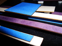
Working with laser-cut pieces and applying them onto a canvas was fun. The result of it wasn't what I had pictured in my head, but it was close. One of the problems I had was for the foam to stick on the canvas. It took a while for the glue to dry. And the other was how was I going to make these shapes "pop out" of the canvas. I didn't think about adding more foam on one side of the piece to create a distance from the other pieces. As far as color choices, I really like the blue, white, and purple combination. I tried using red and yellow but I felt it was too 'child-like'/'playful'. I was happy with the way the laser-cut pieces turned out and the spray paint stick pretty well on the task board. I'd definitely want to experiment with this type of work more! Thanks for your feedback guys, it means a lot!


Wednesday, February 10, 2010

Project 1

So it took about a week to figure out what reference source/image I wanted to use for Project 1. I'm very much interested in Cubism and Russian Constructivism/Suprematism and was able to learn about their pieces, many of which appear to be all flat. Artists were using geometric shapes and wanted to represent these objects from all viewpoints, but failed to show the 3-dimensionality of objects on the flat surface. I chose one of Malevich's piece as a reference image. John encouraged me to try and play around with layering/crossing of the shapes. I made a sketch on Blender and layered geometric shapes on top of another and it gave me an idea how I'll be layering these pieces together. I am laser-cutting the geometric shapes from his piece (No way I'm cutting shapes with an x-acto knife. Thank God for laser cutting machines!) and somehow want to try and have the pieces "pop out". I have a clear picture of how the final piece is going to end up and I'm hoping I can get it the way I visualized it. I'm crossing my fingers. I will be applying this onto a 18x24 canvas. This morning I went to get the shapes laser cut. Cardboard was the initial plan, but the bookstore had run out so I went with the alternative and bought taskboards instead. The process went by really fast and I'm satisfied with the way it turned out. I now just have to figure out what colors I want on which piece and once I do, I'll start putting it all together. I'll be posting more pictures on the process!


edit - update 2/15/2010
so the the color choices were gold, silver, purple, red, blue, and yellow. I was still unsure which ones I'll be using so I bought all of them. I tried different color combinations, but decided to use purple, blue, and white (will be buying the spraypaint tomorrow) and have the canvas spraypainted black.

Wednesday, January 27, 2010

struggling!~

Week 4, Tuesday: So unfortunately, I don't have a praying mantis on this post. :( I attempted many times and struggled all weekend trying to model this thing. I had a few problems with the mirror modifier, rotating and scaling. At one point I couldn't even scale. I got really frustrated and ended up starting from scratch because it just got to the point where I forgot where I was in the tutorial. And I found myself lost following the tutorial because it was being done so fast. I want to try and attempt this again....

Thursday, January 21, 2010

unwrapping bananas. + suzanne.

Thursday, Week 3.

unwrapped dole bananas!
a bit too glossy which i will fix.

unwrapped suzanne.